Ben Brooks [posted some thoughts on the good and the not so good aspects of iOS 7](http://brooksreview.net/2013/09/a-few-thoughts-on-ios-7-that-others-may-not-touch-enough-on-and-thus-will-make-me-cranky-if-i-dont-post-about-them/). I have to take task with some of them, because not all is rosey.
#### The Good (Apparently)
> The lock screen is f*cking gorgeous — I don’t care what anyone says.
Well I say not so gorgeous. The time font is too light. I no longer wear a watch because I’ve always got the phone to hand, and got used to quickly checking the time or date. That’s not so easy now, you have to orient the device and consciously focus to read it off.
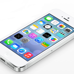
Also, the status bar is an abortion. What possessed Apple to change the age old convention for signal strength for something that conveys the same information in more space? That ain’t innovation. They’ve decided to change the network symbols (o, E, 3G) for acronyms that still mean nothing to the lay person. That now crowds out the network operator name if it’s more than 4 characters meaning it now scrolls back and forth and is truncated the rest of the time. And then all that runs tightly up to the pill used to indicate that you can reveal Notification Centre, except I bet most people are oblivious to its existence, so benign is the hint. No, the lock screen is not gorgeous, or hugely functional. 5/10.
> Control center negates the need for any flashlight apps and generally makes me a very happy man.
Agreed, it’s not bad, but I could do with loosing the playback controls as I rarely use music services, and they dominate the UI. The flashlight is way more convenient than loading an app, and you can turn off the screen once it’s on. 8/10.
> The Today view in notification center is near perfection and eerily accurate. It’s the best way to keep your day on track and I hope developers (like todo list apps) are able to tie into that in the future.
The Today view is an abysmal abomination. What a waste of space. Jonny I’ve had his eyes shut and his nuts in a vice if he had anything to do with that. When will calendar designers realise that this isn’t paper anymore. You can actually remove wasted space when there is nothing to show, instead of making the user scroll. Seriously, one and a half screens to tell me I have no events today or tomorrow? I have no idea what the All or Missed tabs mean as they are both empty and devoid of explanation.
Oh and the convention of tapping the status back to scroll back to the top of a list/document/page is now broken – calling up notification centre seems to cause apps to scroll back to top when you wouldn’t have wanted that.
0/10.
> Auto-update is fantastic
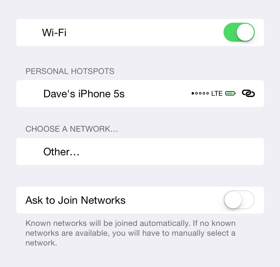
It would be if it didn’t assume that a wifi connection was high speed or low cost. I use a mifi device mostly, so it thinks I’m on wifi and wants to do all sorts of high bandwidth things like auto-update, backups etc and burns through my credit. Network services need more intelligent control regardless of the connection type. A device profile would be good, so under wifi settings, I can disable certain background services, like update, backup and mail. Apps should be able to plugin to it as we’ll, so you don’t download large files on shit or costly connections without confirmation. 5/10.
> You can set any IMAP account to archive emails instead of delete them. Praise be…
Woopydo. Yet when mail check fails due to invariably shite network coverage, you have to clear an alert box for every mail account. I have about 10 accounts due to different roles so this is incompetent but it’s been that way for ever. Yes I could aggregate my mail, but I shouldn’t have to. A notification would be enough, not an alert.
Oh and whilst writing this I discovered that you can mark text and scroll at the same time. Is this 2013 or not? 3/10.
> In Settings, under Phone, you can set a list of blocked numbers. I put all the phone numbers of my exes in there — I recommend you do the same because it is glorious.
Get a life. This is more a statement of society than it is about phone features.
> Don’t be fooled, the Calendar app is a winner. I don’t care what anyone says.
Don’t even get me started on Calendar apps. It might not have leather stitching but it is still a crock invented about the same time as the Gutenberg Press. 2/10, and I’m being generous.
#### The Not So Good
> “Designers†still won’t shut up about the icons and typography.
Probably because they know a thing or two. The fonts are too simplistic and the icons break the first rule of design – let things breathe. It’s all delightfully modern, but it needs another go around the design department.
> You still can’t get rid of Newsstand.
Nor any of the other stock apps. But you can put it in a folder, which is an improvement.
> Despite #1 on this list, the Camera app icon is horrid.
Just like the rest of them then. Actually, I’m ok with Mail, Phone and Messages. You’ll notice that they all have some room to breathe. See how that works?
> Apple made it harder to manage playlists.
Is that even possible? I’ve never used playlists because they’ve always been horrible. Presenting and filtering music collections needs a major overhaul.
> You can now swipe to unlock from anywhere on the lock screen
Yes, but not until after the annoying fade in animation. I guess it’s looking for the fingerprint sensor that my iPhone 4 doesn’t have.
And on the subject of fingerprint scanners, not only will you now get mugged for your phone, but assaulted in the process as the thief gets you to unlock the phone and enter your password. What’s always been the sensible advice when mugged? Just hand over the phone/wallet/jewellery. Except now you don’t have that choice. Better take up running as a fallback. Hey, perhaps that’s why they put that motion coprocessor in there?
But, for all my gripes and sarcasm, I do like it. It’s got some rough edges, but it’s a welcome refresh of the design and good riddance to skeuomorphic nonsense. The platform as a whole still rocks.
One thing I’ve been meaning to mention though. Everyone assumes that iOS 7 was the immaculate conception of Jonny Ive, but I think it’s history goes back somewhat further than October 2012. It’s always enlightening to look back at what API changes appeared in the previous iOS release as a signpost if that’s coming. iOS 6 included appearance APIs that helped developers transition their apps away from custom UI code, which many did. That was necessary for a wholesale UI revamp of the OS as it carried more apps forward in a shorter timeframe.
Which begs the question, what API changes are in this release that hints at what’s to come?


