[Thoughts on Skeuomorphism in UI Design – Kaishinlab](http://kaishinlab.com/2011/07/skeuomorphism-in-ui-design/)
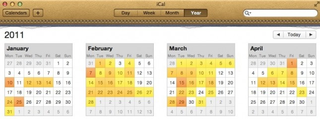
> Skeuomorphs in UI design refer to interface elements that retain obsoleted visual or behavioral aspects of the physical objects they are based on. […] Apple has been riding the skeuomorphism wave for more than a decade, alienating pundits and users alike in every episode, the most recent of which involves the redesigned iCal and Address Book in Lion, sporting a new skeuomorphic look heavily borrowed from their iPad sister apps, Calendar and Contacts.
> The iOS-inspired interface came under harsh criticism, dismissed as an unnecessary gimmick and mocked for being hideous, even infantile. While the reaction seems quite disproportional to me, I admit that there are major arguments standing against skeuomorphism in UI design.
This is something that is really starting to bug me. I’ve had a love/hate relationship with Calendar and Contacts on IOS since I first got one, and now the futility of the interface has been transferred to OS X Lion. It’s wrong on so many levels I actually don’t know where to start. Not only is the interface abhorrently noisy, most of the metaphors don’t hold true. The usability of both applications (critical applications from a productivity point of view) is so badly compromised that these apps are singularly the worst thing about the Mac ecosystem.
What I find most appalling though is that there is a real scarcity of alternatives. iCal alternatives are all plagued by week and month views that are trying to mimic paper wall calendar. Do I have to spell it out – we are using computers, typically handheld, and this is the 21st century! There just has to be a better interface.
On app that I’ve tried and at least is trying to break the mould is [Calvetica](http://www.Calvetica.com), but despite the improved typography, it is still hanging onto the past.
UI design on the Apple needs a serious rethink. Stop trying just to make it look pretty, and make it functional. I fear this is one consequence of Steve Jobs leave of absence – the system is starting to be designed by committee, and the devil is in the detail.


another reason not to buy Lion then
(the other being loss of Rosetta which, while I understand the reasons, would leave me without many apps upon which I depend yet can’t / don’t want to invest in upgrading)
Yep, I lost access to one of my apps as a result of the loss of Rosetta, and Apple could have made it more obvious. Overall I’m liking Lion, and i can see where its going, but not everything Apple does is a great idea, at least not in the first incarnation.
You’re absolutely right about iCal. In fact, I found your blog while searching for iCal alternatives. I can adjust to some of the new iCal, but the process of entering new events is beyond horrible.
I view the calendar in Month View because, hello!, it’s a CALENDAR. But if I try to enter a new event while in Month View, iCal automatically assigns the event to the entire day. CRAZY. But having to pay $50 for an iCal alternative like BusyCal seems crazy too.