Finally managed to get the iOS 7 over-the-air update overnight after it became available from 6pm UK time. I’ve not got a brilliant connection on this campsite, but it was not helped by Apple’s servers being overwhelmed. But then you try doing updates of a 700mb download to 300 million people.
1. iPad mini had the wrong timezone from the welcome screen onwards. It had reverted to Cupertino time. I’d previously posted about [how to fix wrong date and time zone](http://davemeehan.com/technology/iphoneipad-has-wrong-timezone-when-datetime-is-set-automatically) but it turned out to just need manually setting and then setting automatic location back on again.
2. No AirDrop on iPhone 4. Don’t suppose this is going to be a big issue for me though. I rarely need to share with other people. Sad I know.
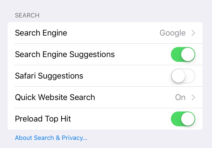
3. Where is Spotlight search? You used to have to press the Home button from the home screen, or swipe right to find Spotlight, but no more. I checked instructions online, and it’s now ‘swipe down on any home screen’. But that should say ‘swipe in the middle of the screen’. If you swipe from the top, you get Notification Centre. Confusing!
4. Touch targets. With the new minimalistic UI, the touch targets for buttons seem smaller than before. I’m having to tap more than once to get things to respond quite often, and I don’t have fat fingers. Perhaps it’s the lack of a border on many elements that’s making them seem less obvious targets for the finger.
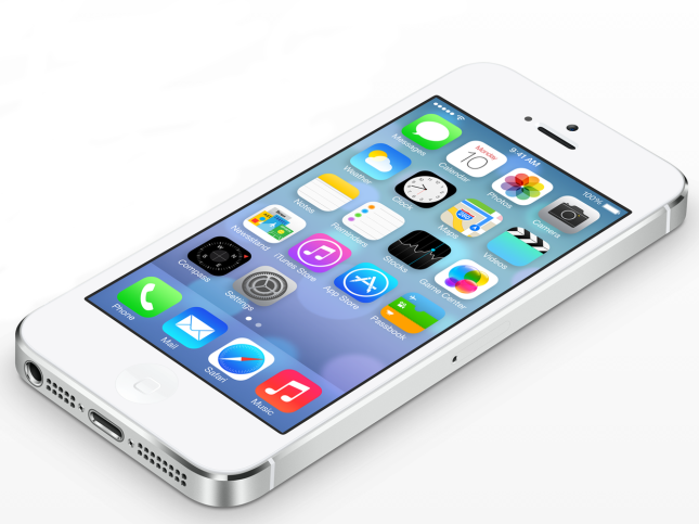
6. No dynamic wallpapers on iPhone 4. But not sure that’s exactly going to be life threatening. There is something about the new home screen icons that also jars against just about any type of background. I think the lack of space with the icon is partly to blame. First rule of graphic design – let things breathe!
7. Control Centre – quick access to system settings is welcome, especially the light using the camera flash, which since moving into the Motorhome comes into play more than in a regular home.
8. Notification Centre – Seems a little pointless spelling out my first appointment for the day. Without all that wasted space I could see the appointment in the list!
9. FaceTime – er, why the need to replace one of my home screen icons with the FaceTime icon? Dear Mr. Cook, shall I come and rearrange your furniture? Zen Steve would have had a fit!
That all for now, I need to go an have words with Siri.


