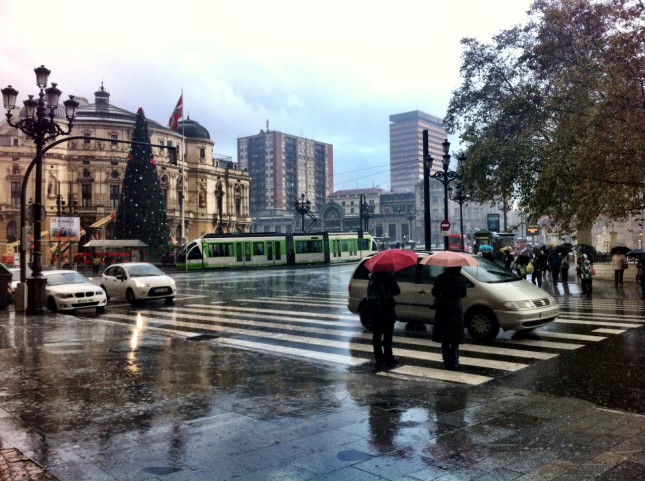
A day out in Bilboa. We decided to leave the van in its beach side carpark in Plentzia and catch the metro into Bilboa. The Basques call it Bilbo, but I’ll try to avoid any references to the works of Tolkein.
The metro is everything it should be – fast, clean, efficient, on time, and dirty cheap. The fact it’s designed by Norman Foster shouldn’t escape or surprise you. The fact Britain hasn’t much to offer up by comparison probably doesn’t either. Why do we excel at things like design and innovation but then have little competence at putting it together?
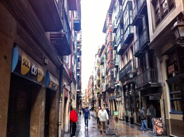
We did a quick saunter through the main shopping area of the town and then found the tourist information office so that we could pick up a map. The very helpful lady gave us a whistle stop tour of the sites on the map, and we headed off in the direction of the old town, just across the river. Narrow streets and tall buildings, and allegedly one of Europe’s largest covered markets (although I was somewhat underwhelmed – it seems not that large and sparsely populated with traders). Back through the lanes we found a humble little eatery offering three courses plus wine for €10.50 which seemed like a bargain and the food was interesting and well presented. No change from £25 back home.
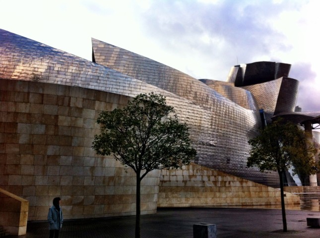
We decided the afternoon shutdown would be a good time to go and see the Guggenheim, and after lunch sauntered around the riverbank, taking shelter from the odd downpour along the way. The Guggenheim is a truly impressive piece of architecture – my pics won’t do it justice and I’m sure you can find many online if you are not familiar – its something that the Spanish are not afraid of taking risks with. Which when you compare it with the general poor standard of construction and maintenance it all stands in stark contrast. The design of the building itself was down to Canadian-American Frank Gehry. It’s equally interesting on the inside.
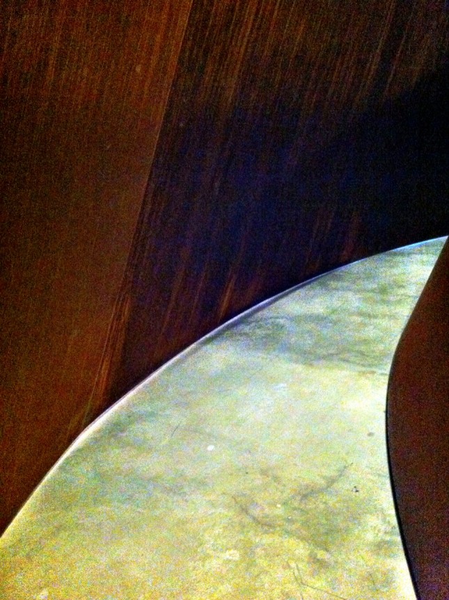
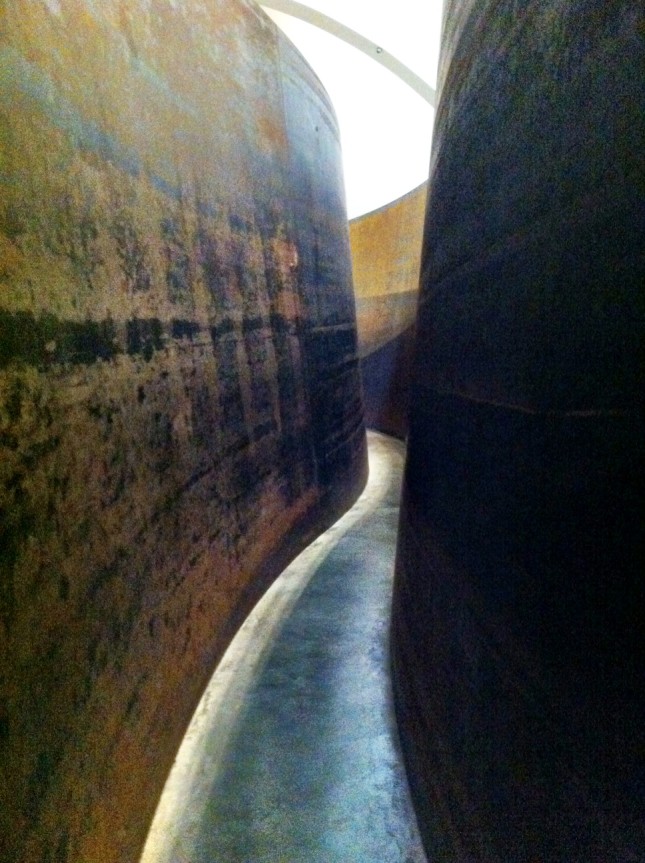
What it lacks on the inside is art. I’ll save the criticism for a moment, I’ll hold the exhibition by [Richard Serra](http://www.guggenheim-bilbao.es/en/works/the-matter-of-time/) out as a candidate for ‘must see’. When you realise these shapes are created from 2 inch thick sheets of steel, bent into spirals and ellipses, you’ll get an idea for the scale and ambition of the work. Stunningly simple in concept, they are very powerful. I had this feeling of some ‘2001 A Space Odessey’-esque quality about them. Massive, hidden forces at work. When I get back to living in a house, I’m going to be trying to find a way of incorporating the sensuous curves into the plan. I hope. One day.
Anyway, now for the underwhelming. Antoni Tapies was obviously Tracey Emin’s inspiration. But in fairness its probably hard to judge without some context which the exhibition, information boards or the audio commentary failed to provide. He might have been a prominent artist in both Spain and the Basque region, and possibly internationally, but to describe his work as ‘found objects’ would actually be kind. Stumbled upon perhaps. I realise that we probably missed a trick when we cleared the house out. We should have taken those piles of tat and crap and put them into an exhibition and lived like kings on the new found international fame and fortune.
There was also an exhibition of selected works by various other so called artists who equally, largely, managed to display any talent for anything other than getting a name for themselves by nefarious means.
The Guggenheim was great, but alas the art (Richard Serra aside) was distinctly underwhelming.
